My Role: Product Manager
Client: Filisia Interfaces
Sector: Education, IoT
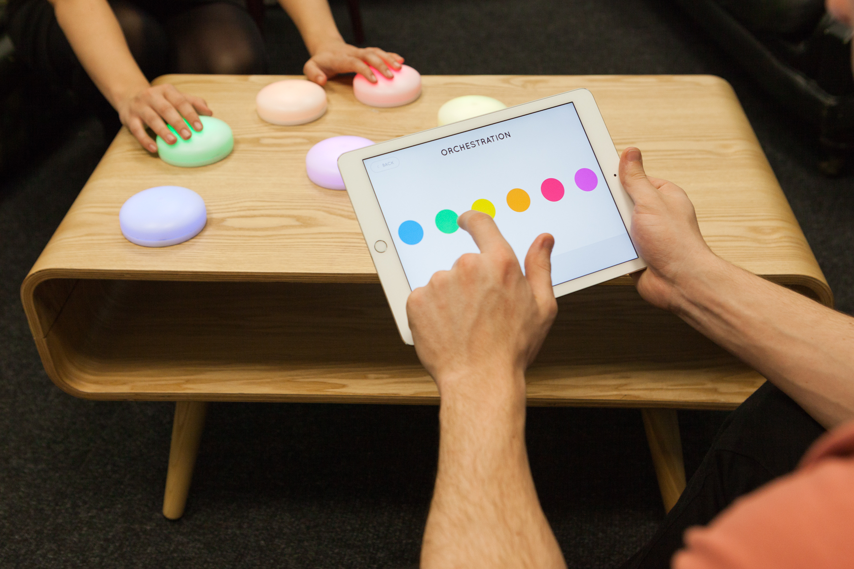
I was a Product Manager of a team of two additional UX Designers for Filisia- a company reimagining play and therapy for early years learners and people with special needs.
We were brought in to work on their flagship product, Cosmo, a platform of interactive IoT devices, iPad applications, and data analytics tools used in childhood education and elder care.
The Problem
Cosmo’s website had not been updated since the product’s concept phase, and as such was not structured to support organic traffic or drive sales.
Our brief was to create a product site fit for a scale-up, with information architecture and content that supported an exclusively online user interaction from discovery to product education, to sale. Our key metrics were site visitors, demo requests, enquiry levels, and orders by relevant leads.
Initial Research
Google Analytics showed that the website had a lot of visitors, 44% were in the US (opportunity for shipping / delivering abroad) but goal conversion and completion rate was 0%. Even though users were moving throughout the site for a very solid 2+ minutes, there were no sales and requesting a demo was not prominent.
Competitive Analysis
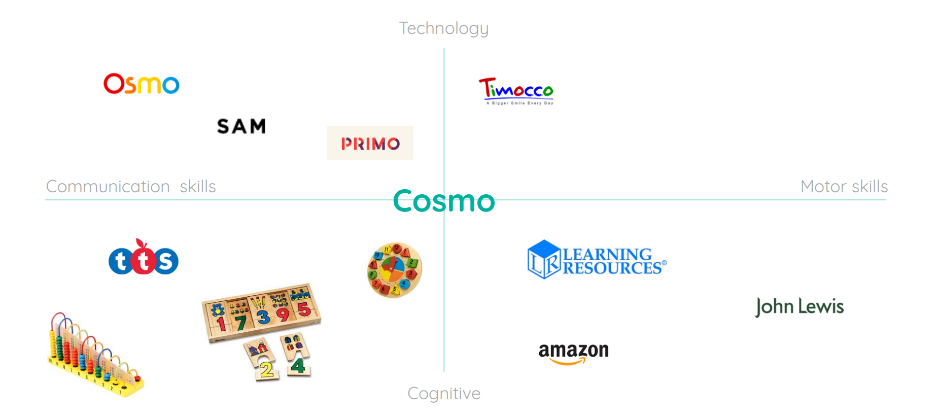
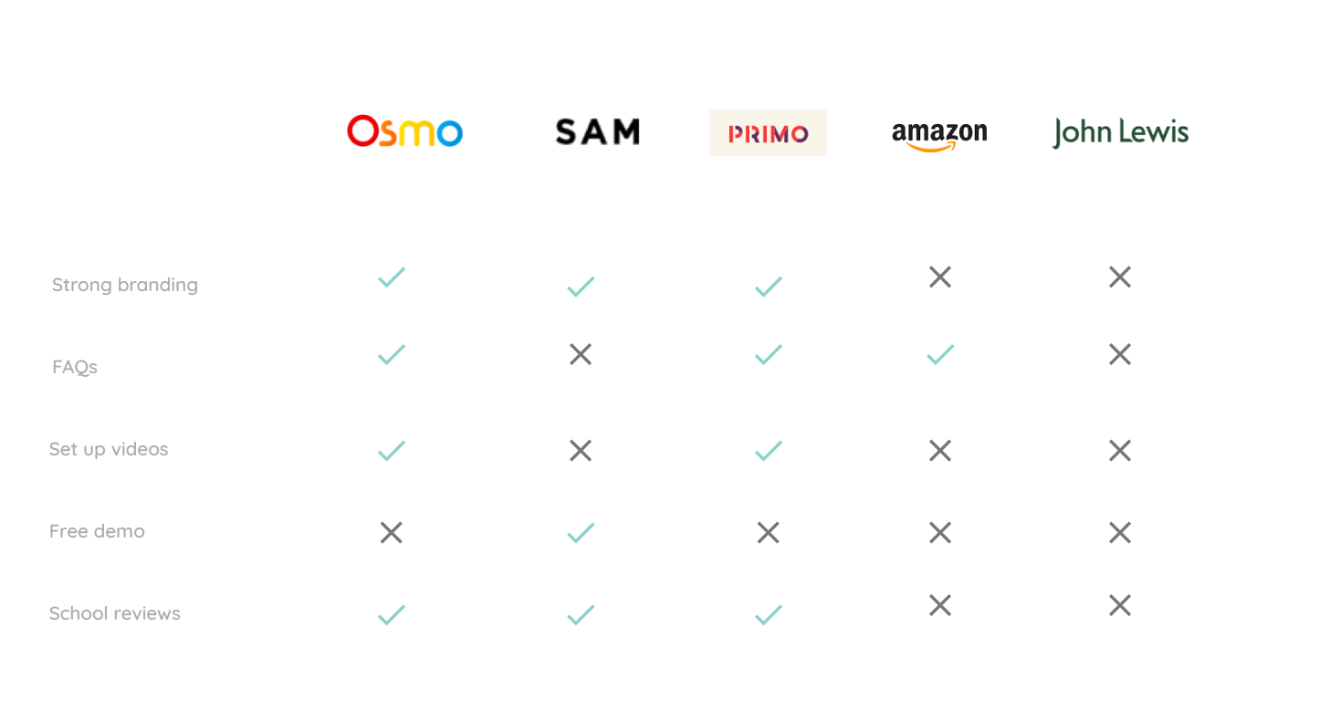
We decided to break down the landscape into 4 key areas to see where Cosmo sits among it's competitors. The outcome was that we could identify direct competitors and indirect competitors, which would help us with strategy.
Surveys
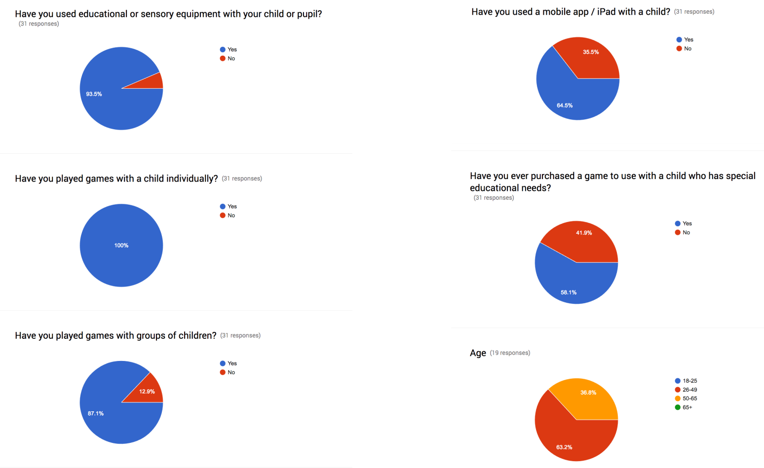
Through customer surveys, we discovered the majority were shopping for their child, or as a teacher for their pupils. All were proficient with technology (specifically iPads), and interacted with children both in groups and individually. Word-of-mouth recommendations carried the most weight with our users, followed by anything scientifically proven to be beneficial.
Define
In order to understand the problem further, and ensure we deliver the correct solution we decided to take our learnings and push them even further. The outcome being a revised problem statement and solution.
Interviews
We interviewed 19 people following their survey responses, diving deeper into their motivations and experiences. This helped us build empathy and get qualitative insight into who is searching for products similar to Cosmo.
- “Yes customisation is a very important factor for learning resources and games, each autistic child is completely different with different needs.”
- “We seek independent suppliers when we have a specific problem when struggling to teach something”
- “When searching for new SEN products, I still tend to look through our currently suppliers and catalogues, however I think now more people are looking outside an independent smaller companies that provide such products”
Personas
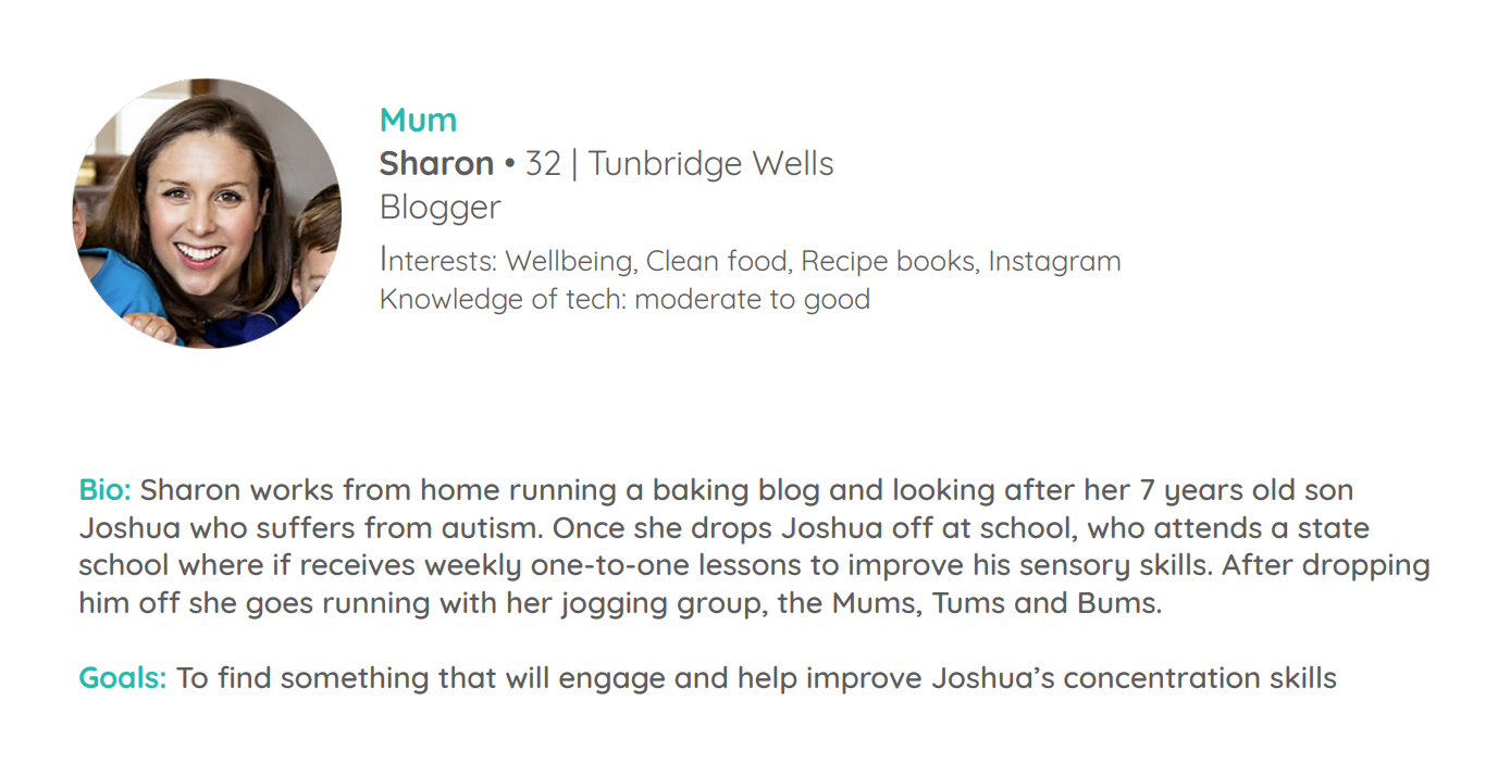
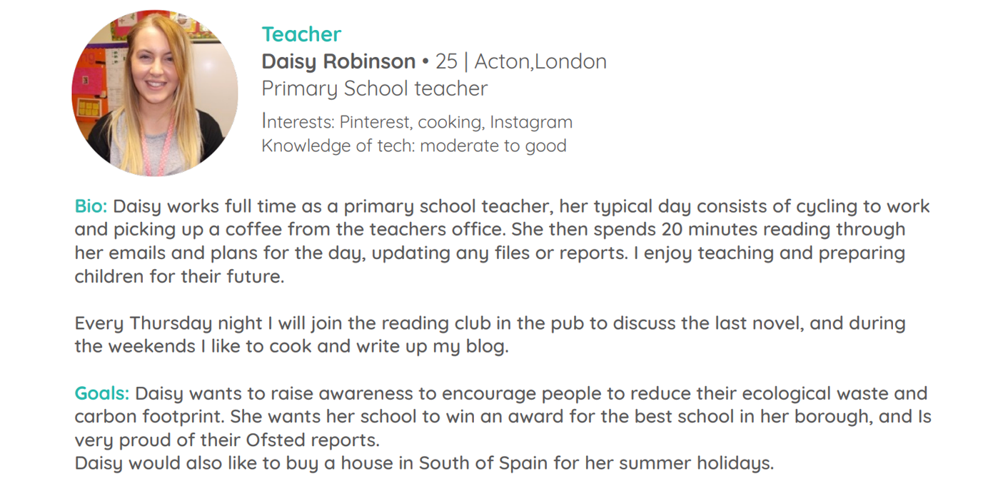
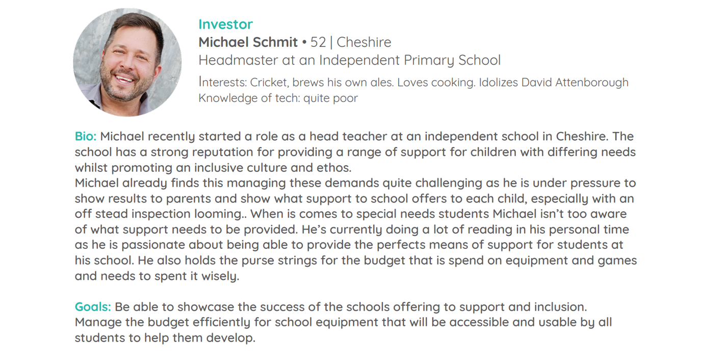
From our interviews and analytics we created 3 primary personas in which to base our design decision on.
Parent
- What are the benefits for my child?
- Is it easy to set up?
- How durable is it?
Teacher
- Can it be used with children of different abilities?
- Is it compatable with the technology we use?
- Are other schools using it?
Investor
- I want the creator to be passionate about their product
- I want to find a profitable product
Experience mapping
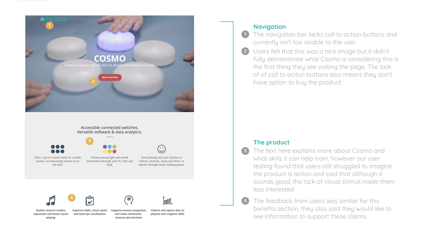
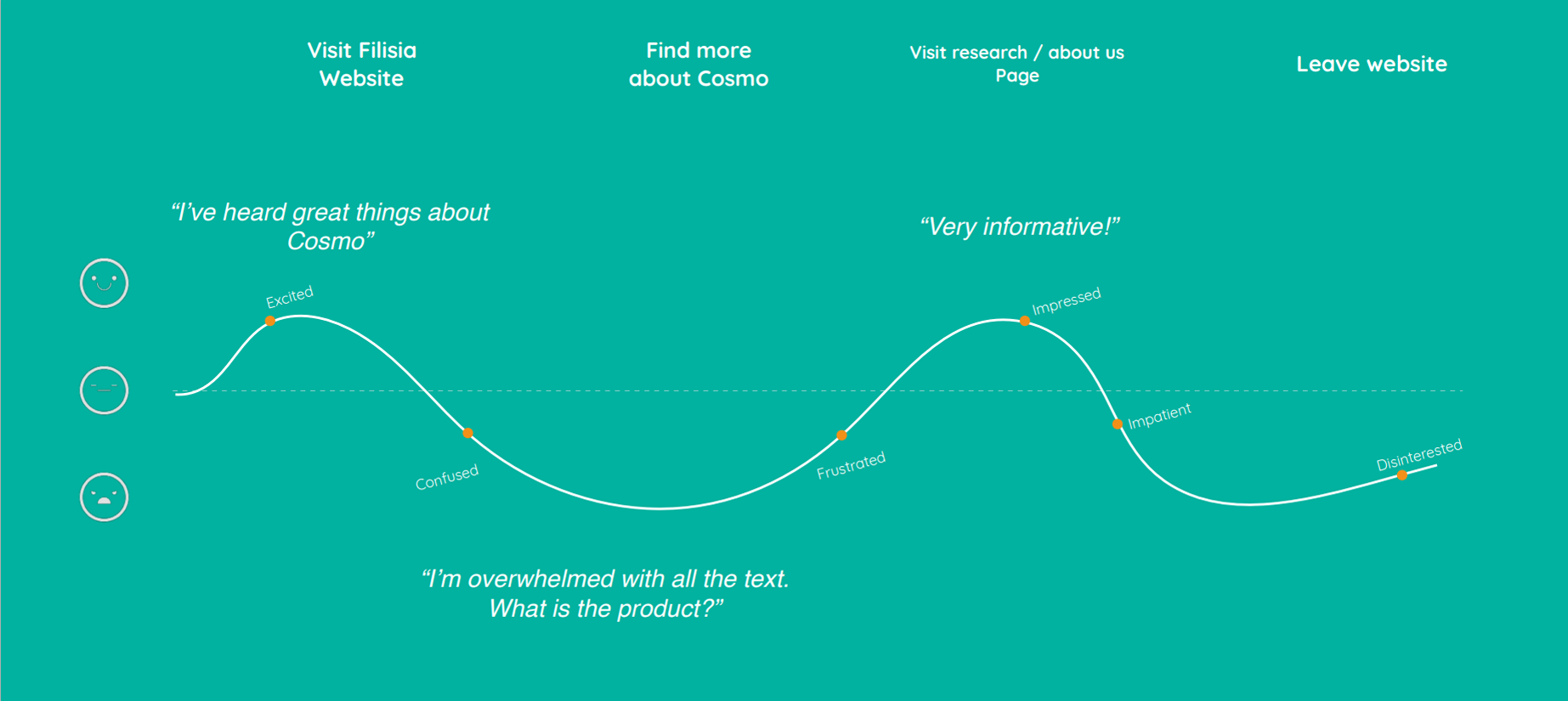
We decided to test the existing site, in order to better understand what works and what doesn't, the outcome was that the majority of people did not understand the product and were left wanting to know more, which naturally lead them to 'Research' and 'About us' pages. However, all left the site feeling a little bit lost and with no next steps.
Solution
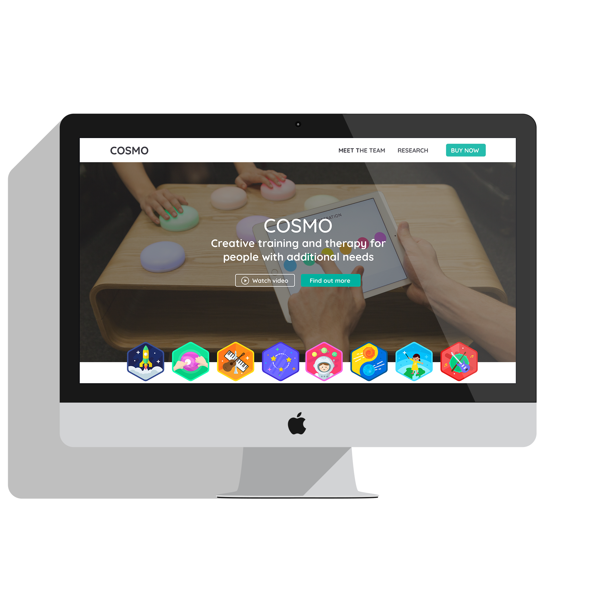
Redesign a landing page with clear information about Cosmo, introduce prominent CTA’s for both purchasing and requesting a demo, framed by positive ratings and reviews to bolster credibility and drive sales.
Design
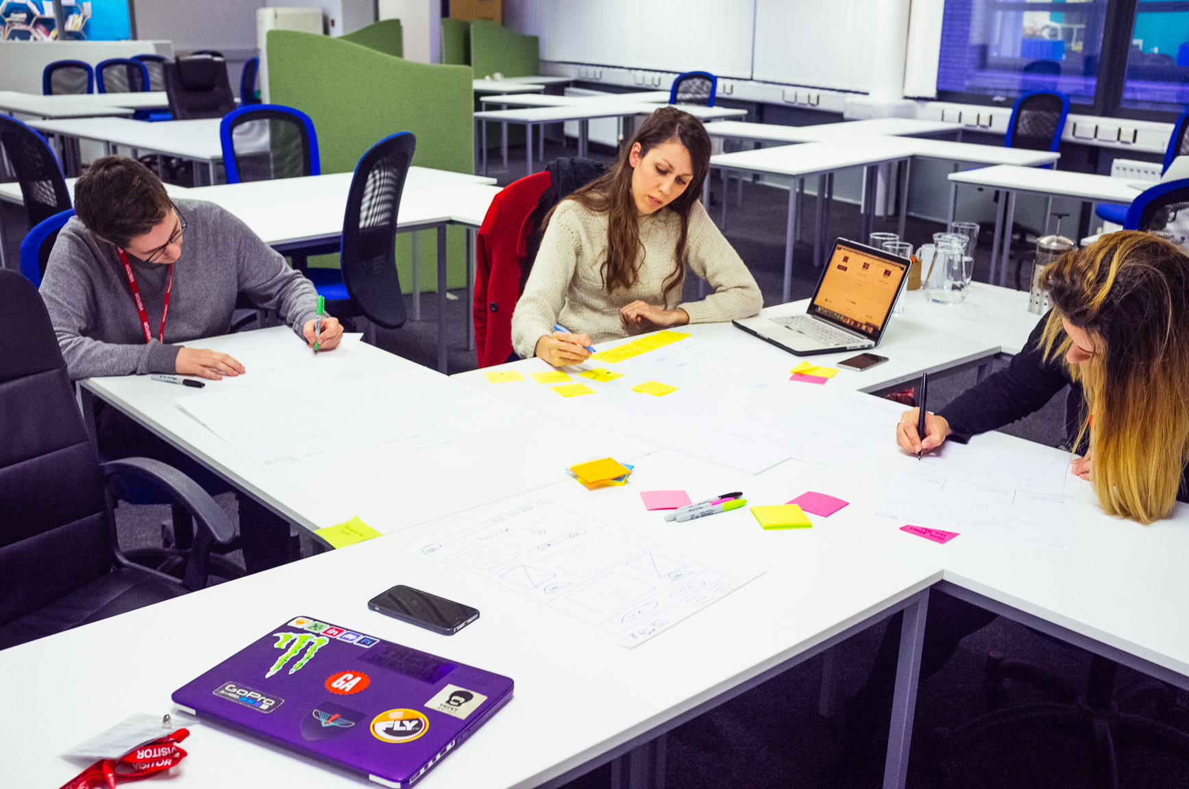
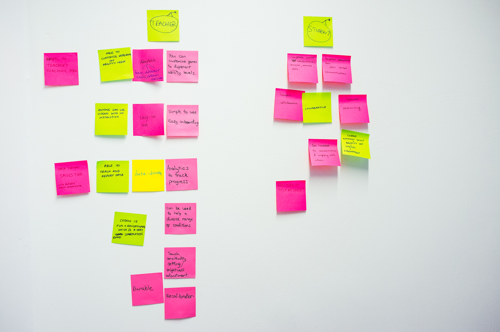
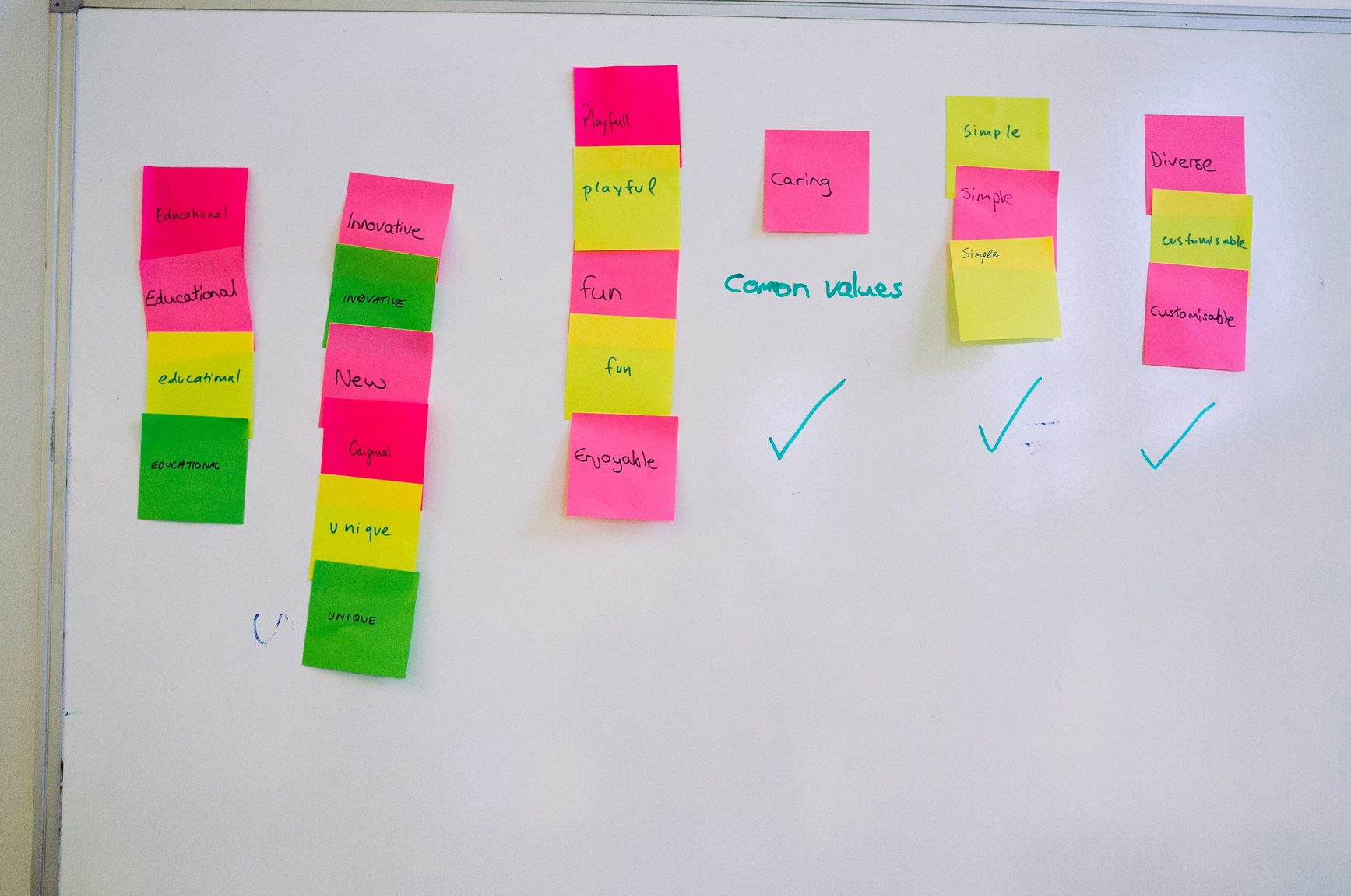
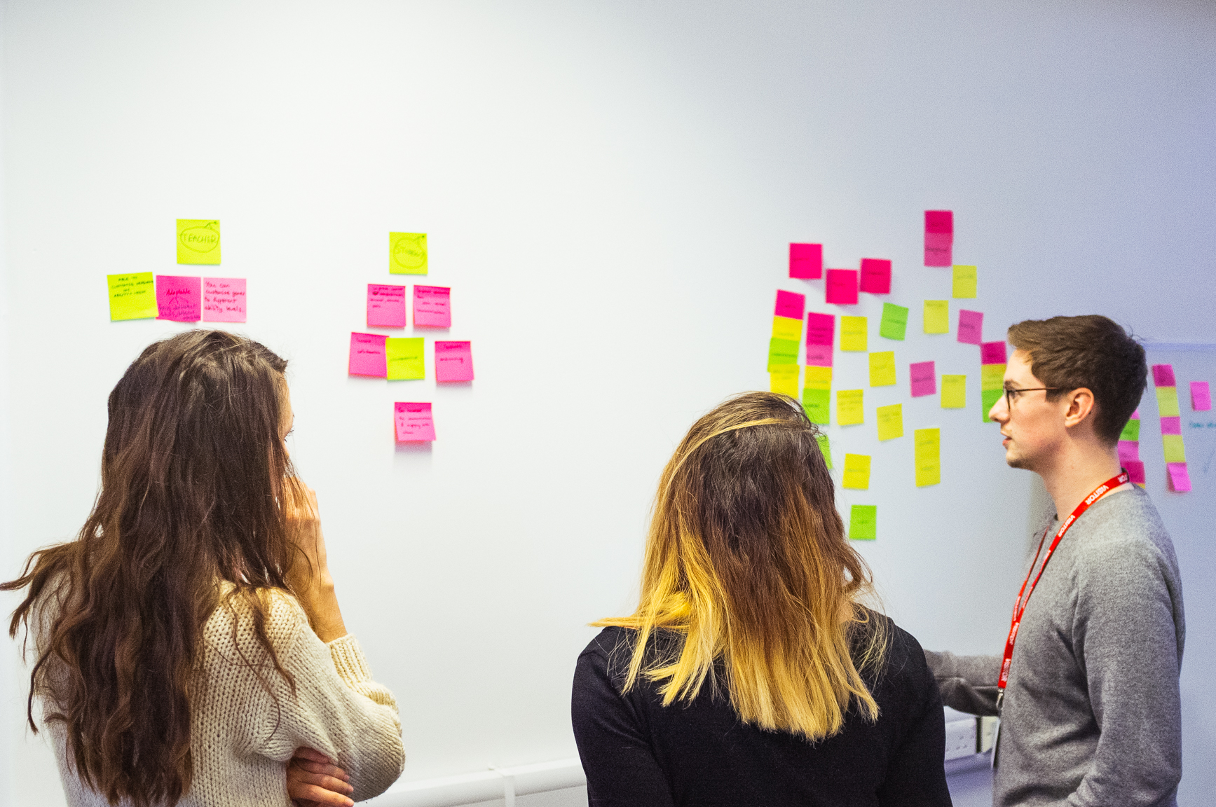
Eager to put our learnings into something more tangible, I set up a Design Studio with key members of the Falisia team, this included CEO's, engineers and lead designers. Multiple workshops helped us gain valuable insight into the company and their business goals, as well as sketching and idiation of concepts.

Sketching
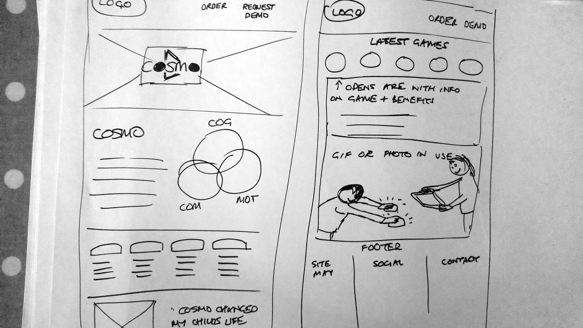
Mocking up initial wireframes allowed us to quickly test and iterate upon our designs, we learnt that the content above the fold was highly important, so understanding what information to display was of highest importance. Testing validated our initial research; people wanted to see the product and understand what it is right away.
Information Architecture
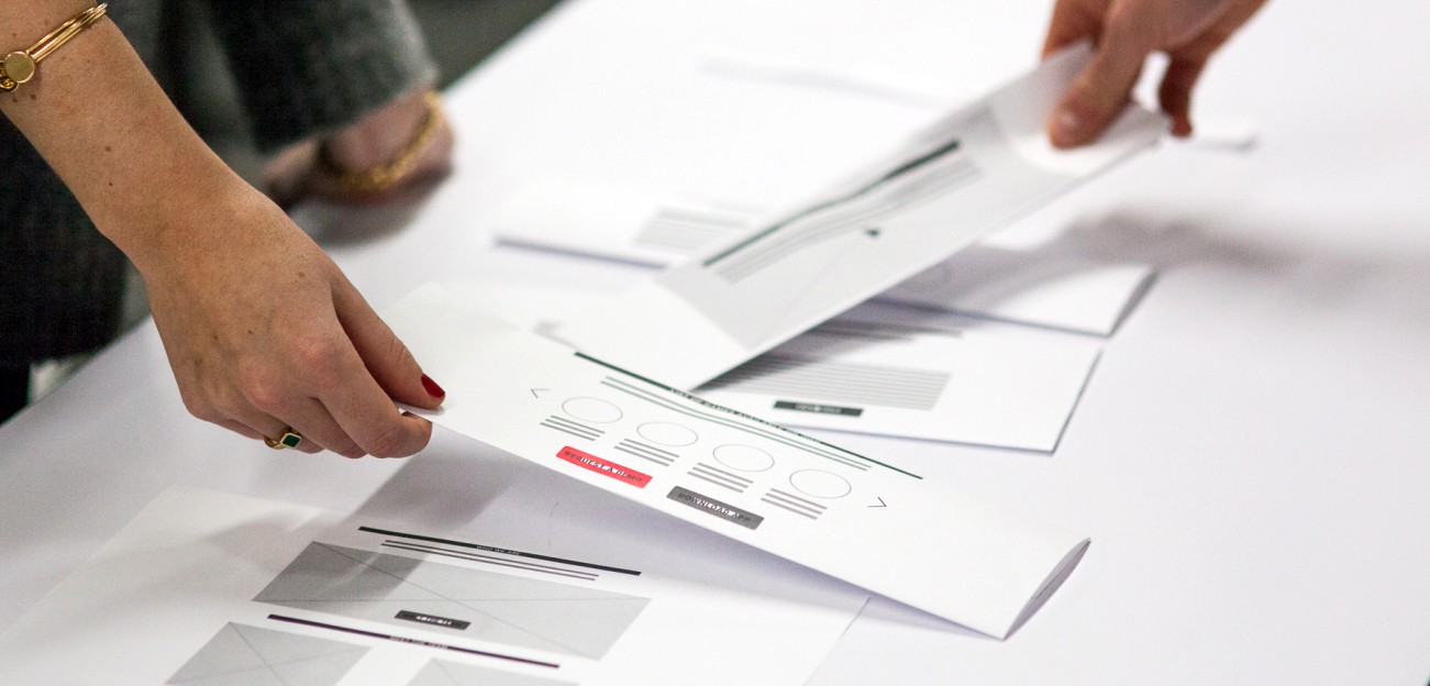
Rapid IA testing showed us that video / GIFs of the product rated highest of importance, with research and evidence second. Next was critical to the business goals and KPI's is the ability to shop and buy. So building a sales page along with a 'Book a demo' became a priority.
- 90% wanted to see product image at the top
- 72% wanted to see the research that backs up the product and transmits trust
- 63% wanted to see what others buyers say (social validation)
The top 5 in order of importance are - Product - What is the product?
- Research - Is this legitimate?
- Reviews - Does this work?
- Buy - How do I purchase?
- About - Who made this?
Prototyping
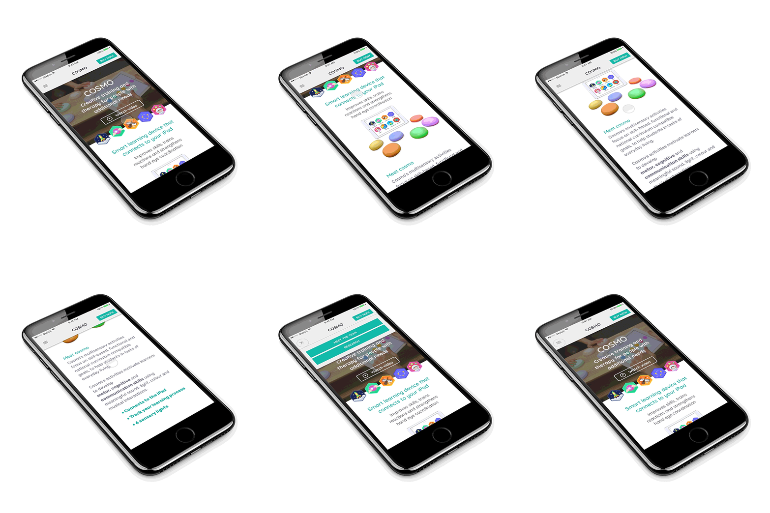
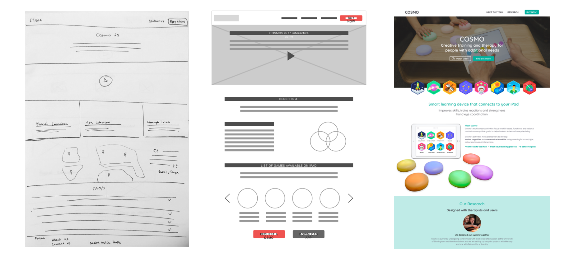
From paper to digital, we increased the fidelity of our designs. This allowed us to test with the initial interview canidates and improve them rapidly until we were happy our layout and information architecture fit our user needs. Web and mobile were created using Sketch and Principle in order to give a realistic clickable prototype.
Testing, testing, testing
- Further testing showed that copy is really important, and using researched based complicated language doesn't sit well with users as it is hard to understand.
Opportunity - Simplify and create a tone of voice easy for users to understand. - The website says Filisia at the top, but the entire site is about Cosmo. Users struggled to understand what is the product and what is the company.
Opportunity - Use Cosmo as the primary, this allows the entire site to be focused on their flagship product. As the company expands, consider changing this. But for now it is easier for the user to understand and purchase the product they searched for.
Deliverables
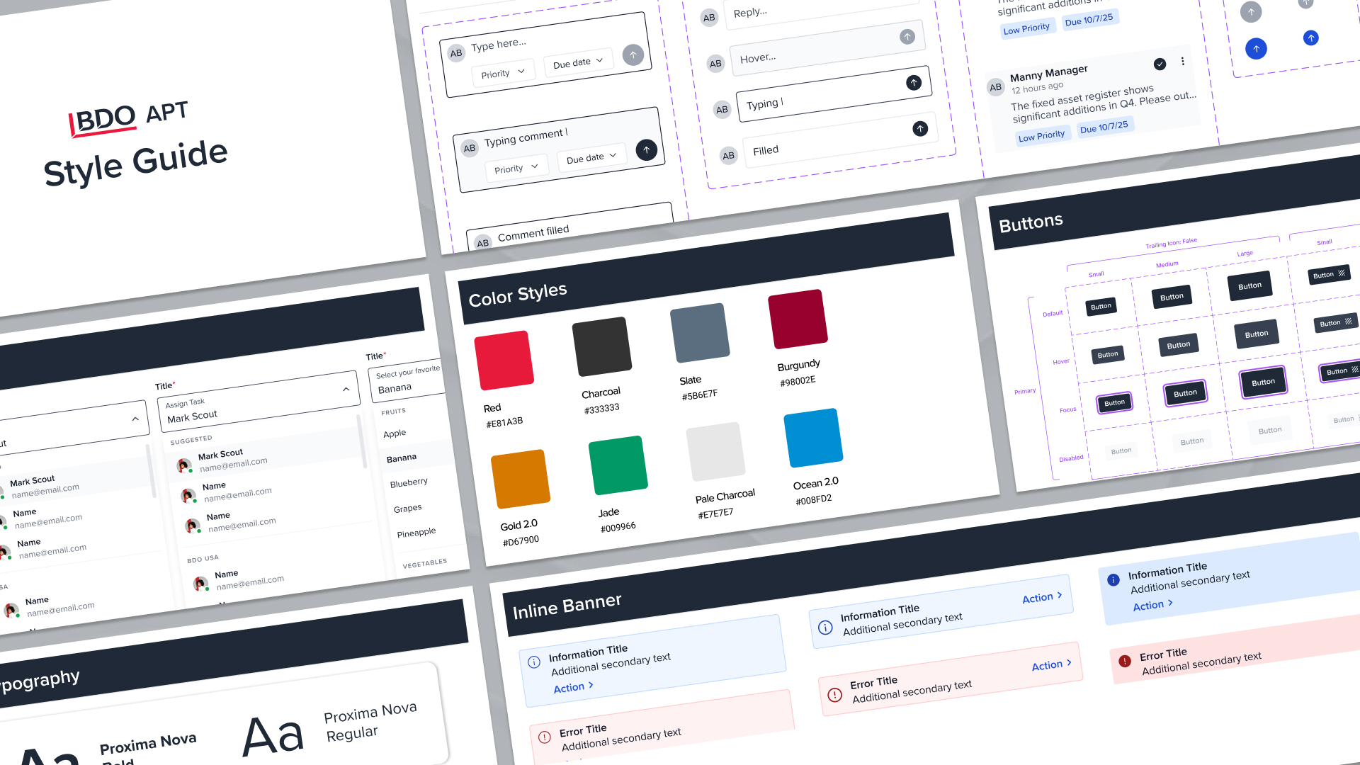
- Style guide
- High fidelity designs for web and mobile
- Ideas for the future
- Product photography and video
