COMPANY
YuLife
MY ROLE
Product Owner & UX Designer - led strategy, research and cross-team delivery
SUMMARY
Turning Insurance into an engaging, rewarding experience
HR teams lacked visibility and long-term engagement with wellbeing - and the product needed a way to drive sustained interaction and measurable value.
OVERVIEW
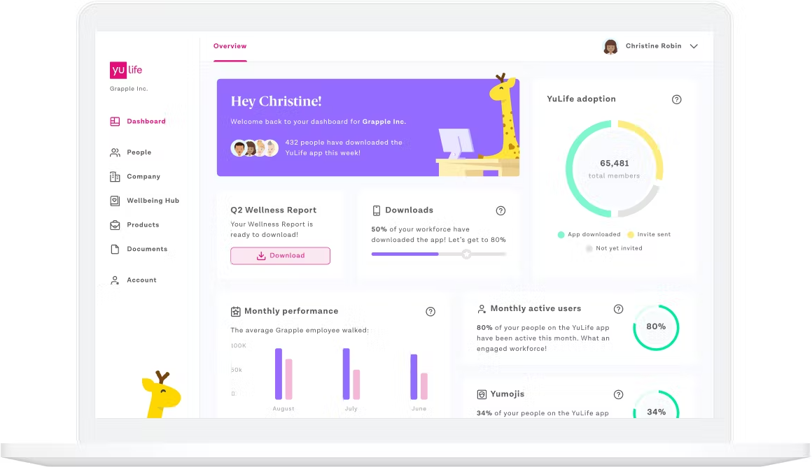
At YuLife, I led the transformation of a standard insurance product into an engaging wellbeing platform that people actually want to use. Through driving cross-team collaboration, forging partnerships with eco-friendly companies for rewards like tree planting, and designing a gamified experience, I helped increase user retention and create meaningful interaction.
- 93% highly engaged users
- 50% of users became super-users, engaging 25+ days per month
- Contributed to YuLife’s expansion beyond the UK into the USA and South Africa
The result is a platform where HR professionals can measure engagement and reward employees, and users actively return, building lasting behavioural change.
THE CHALLENGE
When I joined the project, the foundations were there, but the experience wasn’t delivering on its promise.
- Engagement was inconsistent and difficult to sustain over time
- HR teams had limited visibility into how employees were interacting with the product
- Wellbeing activity felt disconnected from tangible outcomes
The opportunity was to turn YuLife from a passive benefit into an active, rewarding experience for both employees and HR professionals.
MY ROLE
My responsibilities included:
1.
Setting product direction with senior stakeholders
2.
Leading user research, UX strategy, and interaction design
3.
Making trade-offs across business, user, and technical constraints
4.
Collaborating closely with engineering, sales, and account teams
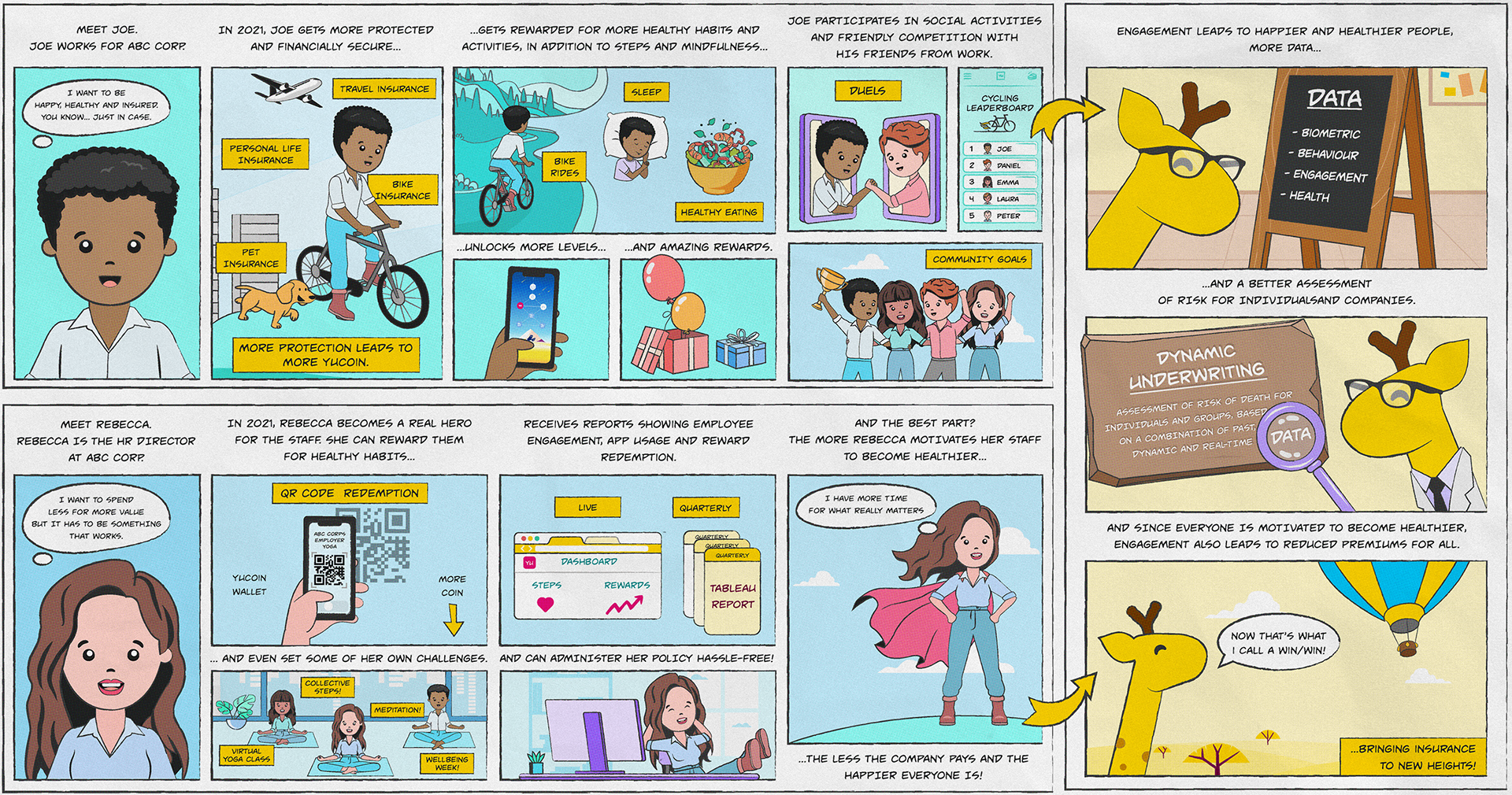
LIFECYCLE ROADMAP
UNDERSTANDING REAL MOTIVATION
Rather than guessing what might work, I introduced a more formal user-centred approach. We spoke directly with HR teams and employees to understand what motivated them day to day, where existing experiences fell short, and how success should be measured. This reframed the problem: engagement wasn’t about adding features, it was about creating a sense of progress, reward, and purpose.
DESIGNING FOR ENGAGEMENT, NOT OBLIGATION
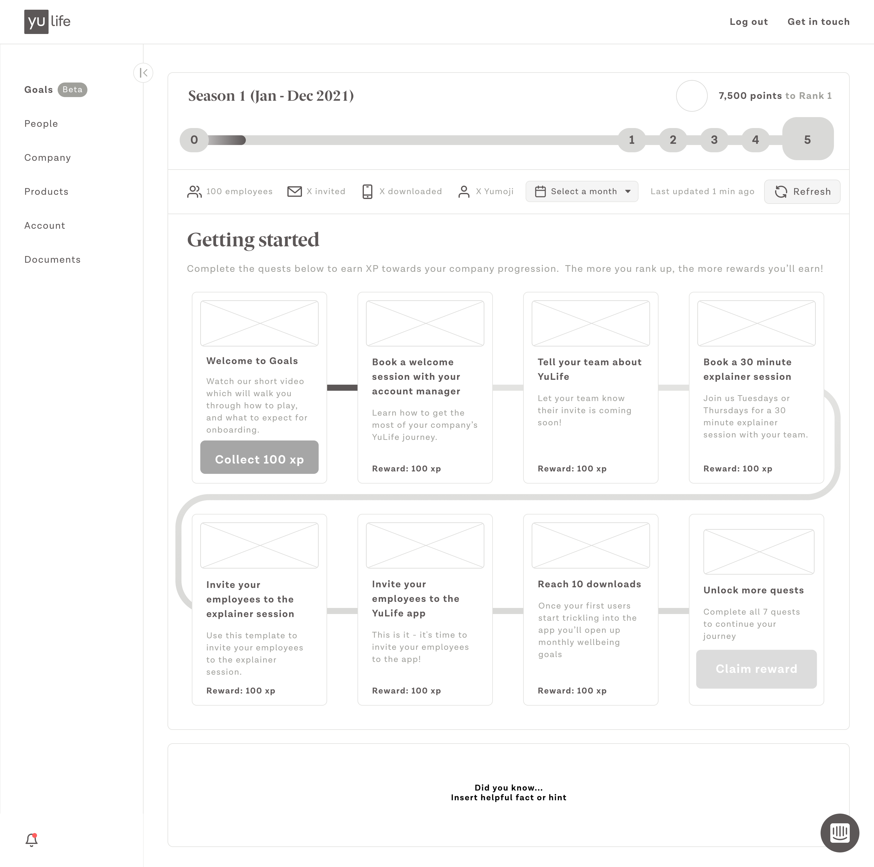
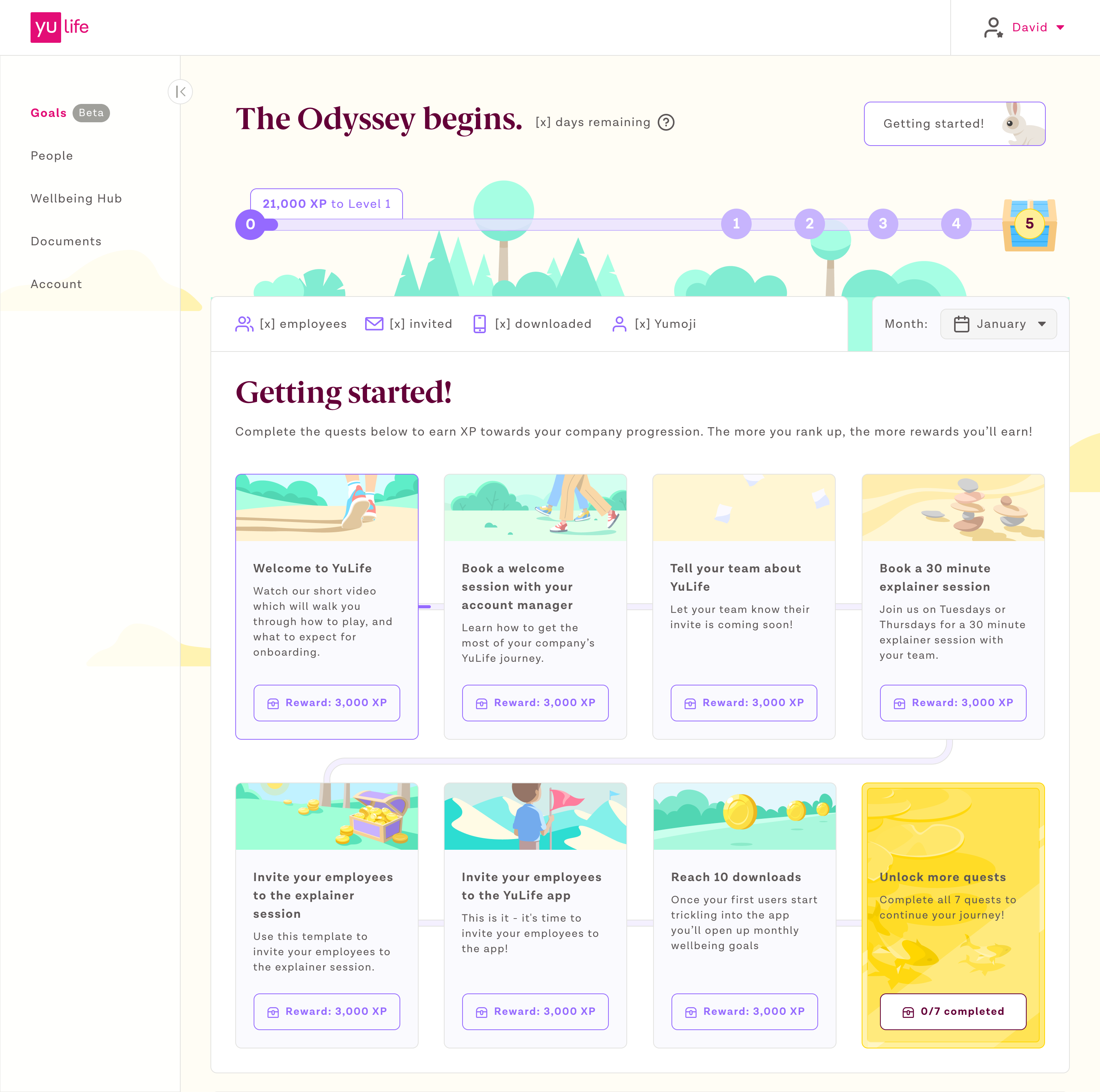
We evolved the product into a playful, narrative-driven experience that encouraged regular interaction without feeling forced. Daily and recurring wellbeing activities were paired with a reward currency, and progression was structured through levels and seasonal content.
Clear feedback loops reinforced positive behaviour. The goal wasn’t gamification for its own sake; it was about making healthy choices feel rewarding and worth returning to.
In order of importance, users stated they wanted to see:
- Engagement and wellbeing activity
- Social impact
- Health impact
- Demographic profile and geography
- Benefit usage
- Reward redemption
DESIGN
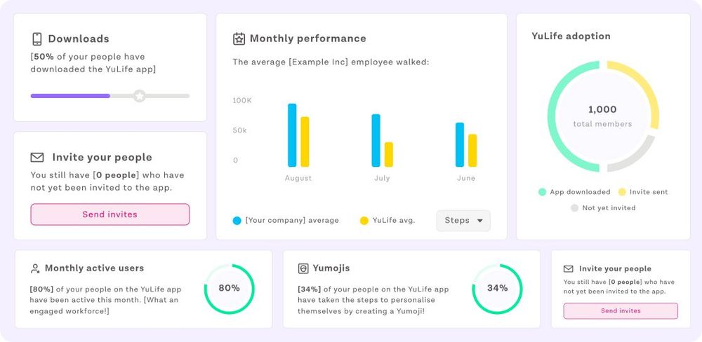
For HR professionals, engagement only matters if it can be understood and acted upon. We built tools that allowed HR teams to track overall interaction, see which activities resonated most with employees, and redeem rewards based on collective engagement. This turned wellbeing from a vague initiative into something measurable, Valuable and actionable.
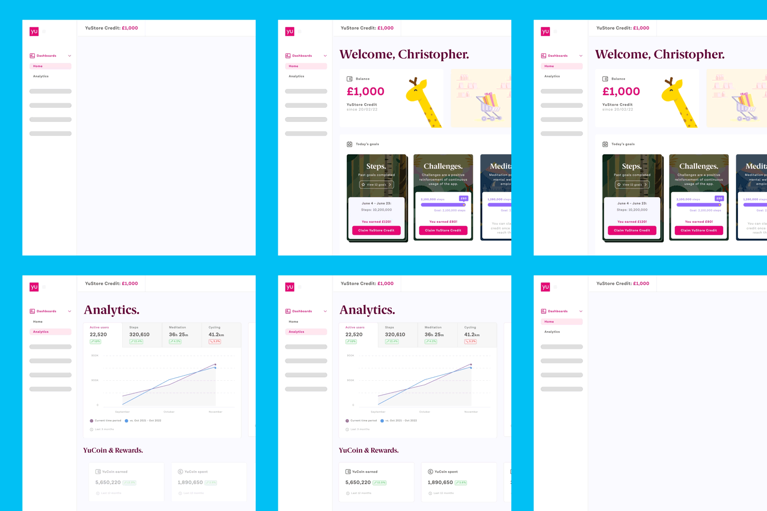
HR open their dashboard, view their latest statistics and enable challenges for their employees
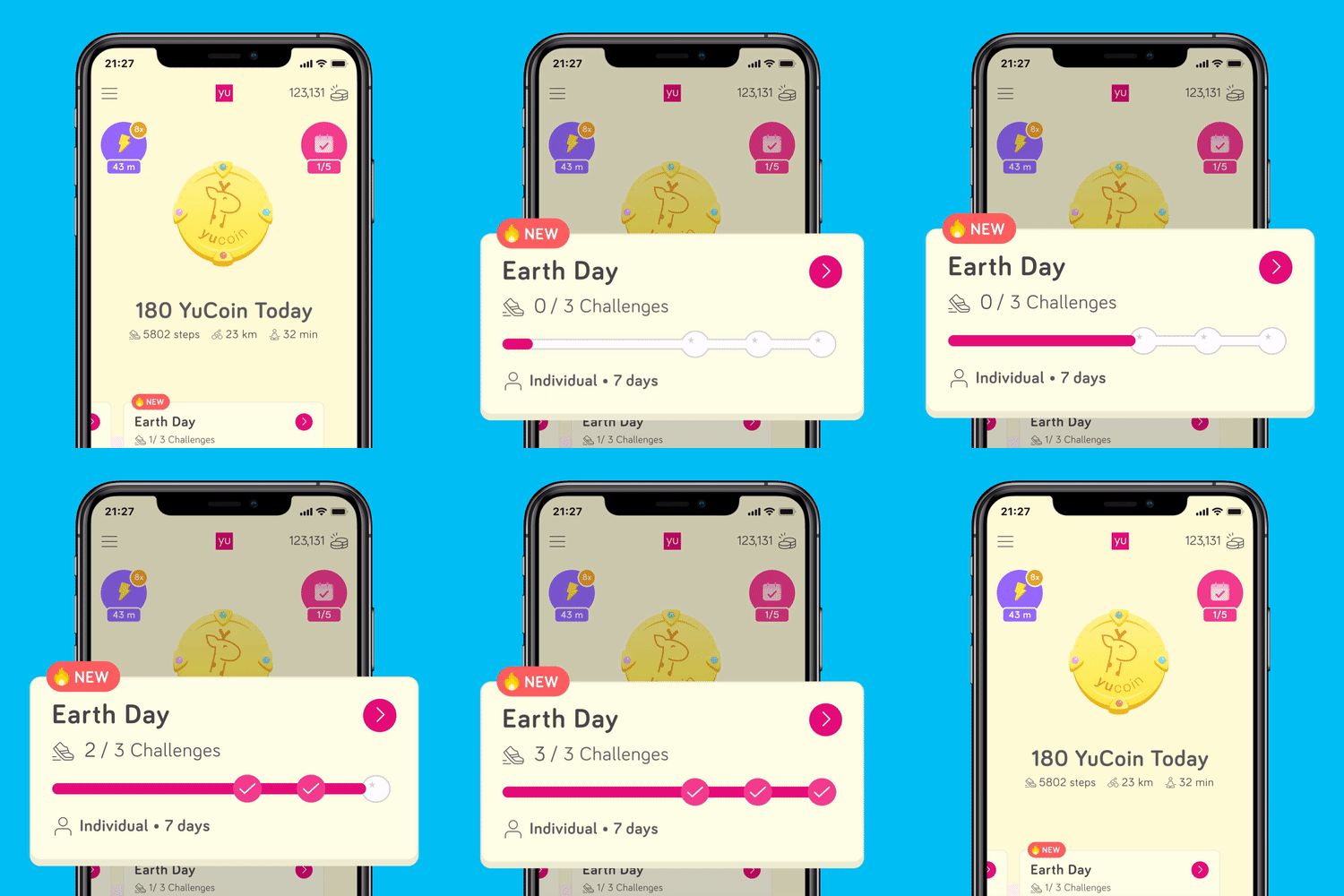
Employees open their app and participate in challenges such as meditation, walking and cycling
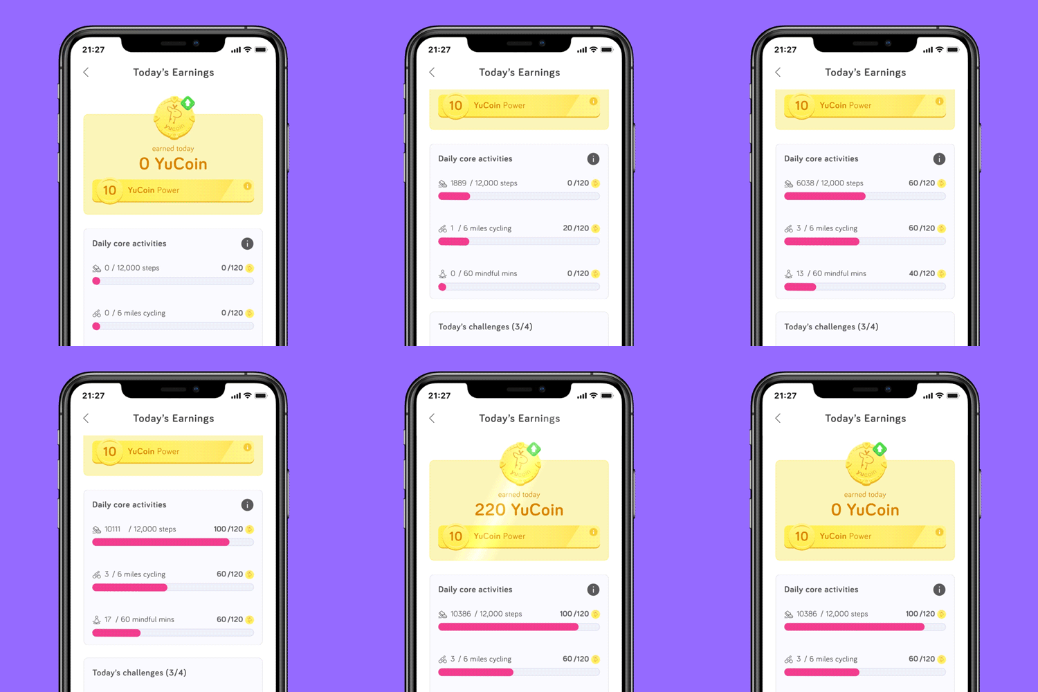
Employees earn YuCoin for challenges and passive activities
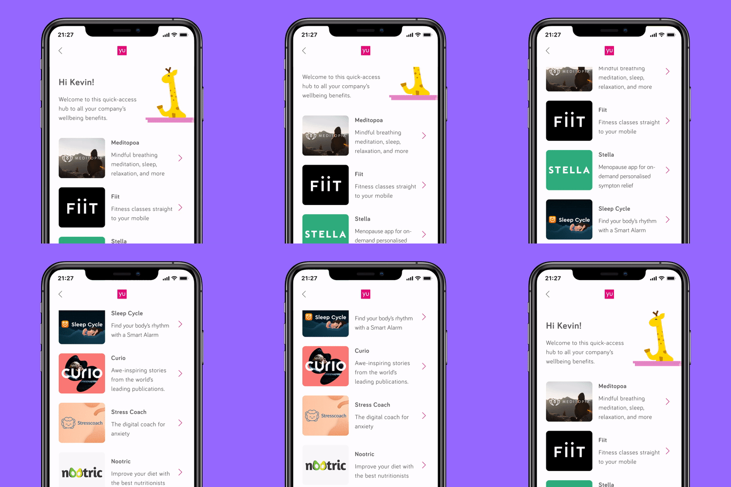
Employees purchase products in-app, using their YuCoin
SHIPPING VALUE EARLY
While the full dashboard experience was under development, sales and account teams needed a way to communicate value clearly. I designed lightweight one-page summaries that explained engagement and rewards at a glance, unblocked enterprise sales conversations, and reduced pressure while the core product matured. These interim solutions kept momentum high without compromising the long-term vision.
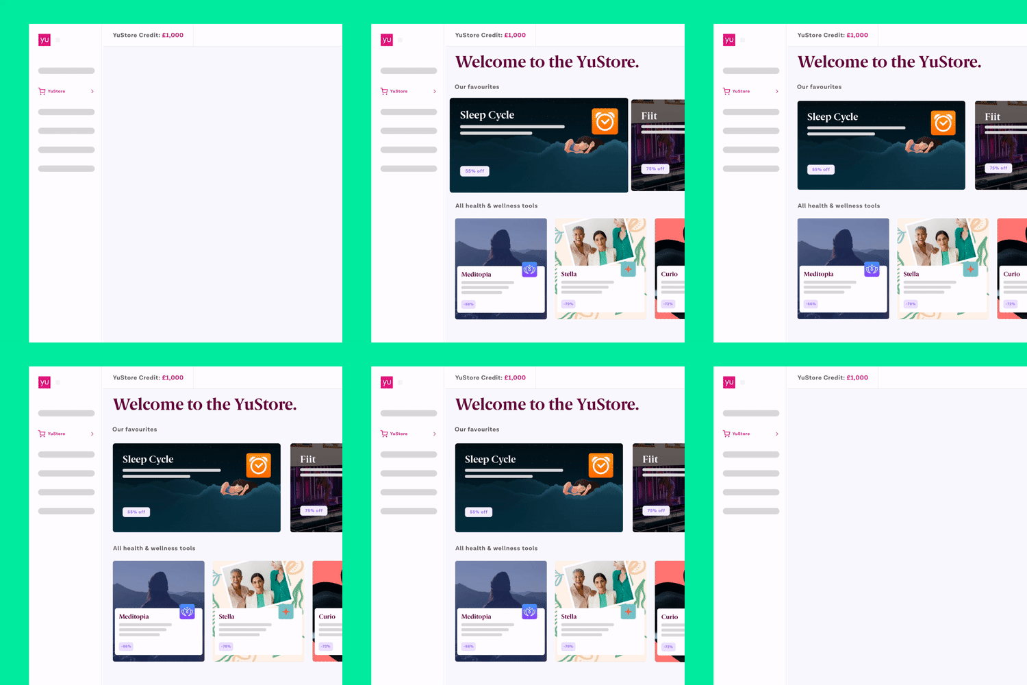
Early 'YuStore' concept for HR to redeem their XP
OUTCOME
The product evolved into a genuinely engaging wellbeing platform that:
- Encourages regular, positive behaviour through interaction and reward
- Gives HR teams clarity and control
- Connects insurance spend to measurable human outcomes
HR admins are now able to:
- View engagement reports
- View health impact reports
- Add customised wellbeing events system
- Access to a customised wellbeing hub
- Self-service campaign management
- Launch campaigns
- View employee resource library
- Live chat for continuous support
HR professionals can redeem rewards based on overall engagement, while employees feel motivated to return and participate.
REFLECTIONS
Engagement is driven by emotion and progress, not obligation. Strong product leadership means knowing when to ship simple solutions, and the best products align human outcomes with commercial value. YuLife reinforced the importance of clarity, restraint, and systems thinking - principles I bring to building thoughtful, scalable products.
Selected Works
