My Role: UX Designer
Client: Cambridge Assessment
Sector: Education
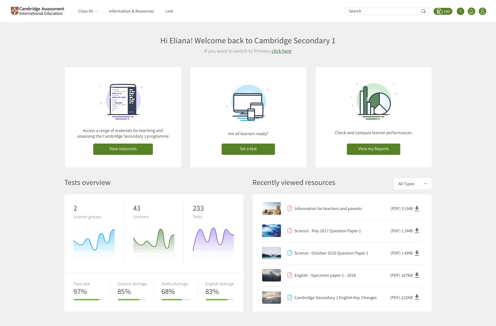
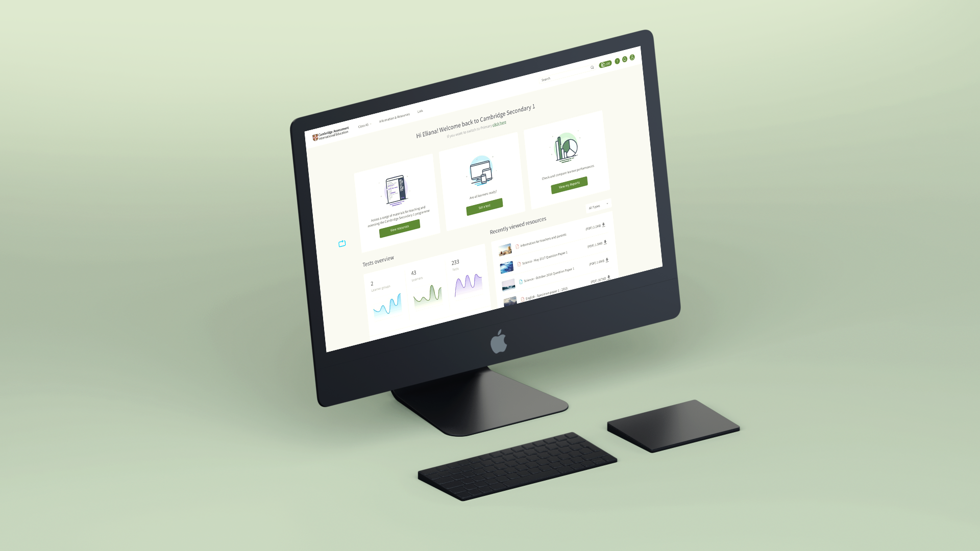
I was brought in to audit and suggest improvements to the latest iteration of CA’s testing system, which included a new dashboard to support educators in administrating, tracking and marking exams.
The first exercise I ran was usability testing - which, to my surprise, turned out to be the first product usability testing their team had ever participated in. Upon learning that prior to my arrival there had been no system in place for UX testing of any kind, I dove in with both feet to try and uncover anywhere else usability had gone unchecked.

Identifying issues
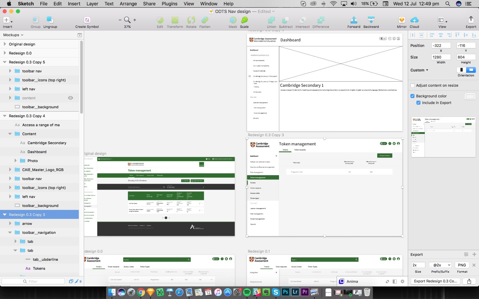
I adjusted the exercise to cast a wider net over potentially-hidden usability issues, and quickly compiled a list of improvements. To give you an idea of the scope of what I discovered, I’ll give you my favourite example:
A consistent theme was users running into navigation issues, causing them to unintentionally exit the journey completely rather than to progress to the next page. The reason, it turned out, was the “cancel” and “continue” buttons were the opposite way around to users’ instincts - in fact, 100% of users clicked or navigated to the cancel button when trying to continue.
Not only was this a shock to users, but it also meant they lost all progress and would have to start again.
Expanding the scope
After the initial exercise, I asked and was allowed to run a design studio with 8 other employees in order to open the conversation and refocus the team around a UX mindset. Though I had been brought in as a contractor on a specific product, I felt that their team would need to make some foundational changes in the way they worked in order to implement and iterate on any of my suggestions.
I was absolutely sensitive to the fact that this team had been working for months to release a product, and I had come in the 11th hour and told them it wasn’t fit for purpose. I focused on presenting my findings in an accessible, easily digestible way in order to demonstrate the value of the exercise and drive buy-in from the team - while making sure they felt empowered, not criticized.
It worked.
With the team onside, I was given free-reign to further chamption UX, IA, UI, and implement major departmental changes with minimal pushback. With my guidance, the team built their first UX foundations into their product process. They created and implement usability and unbiased evaluation, incorporating face-to-face local testing and Lookback sessions with international users.
Building Empathy
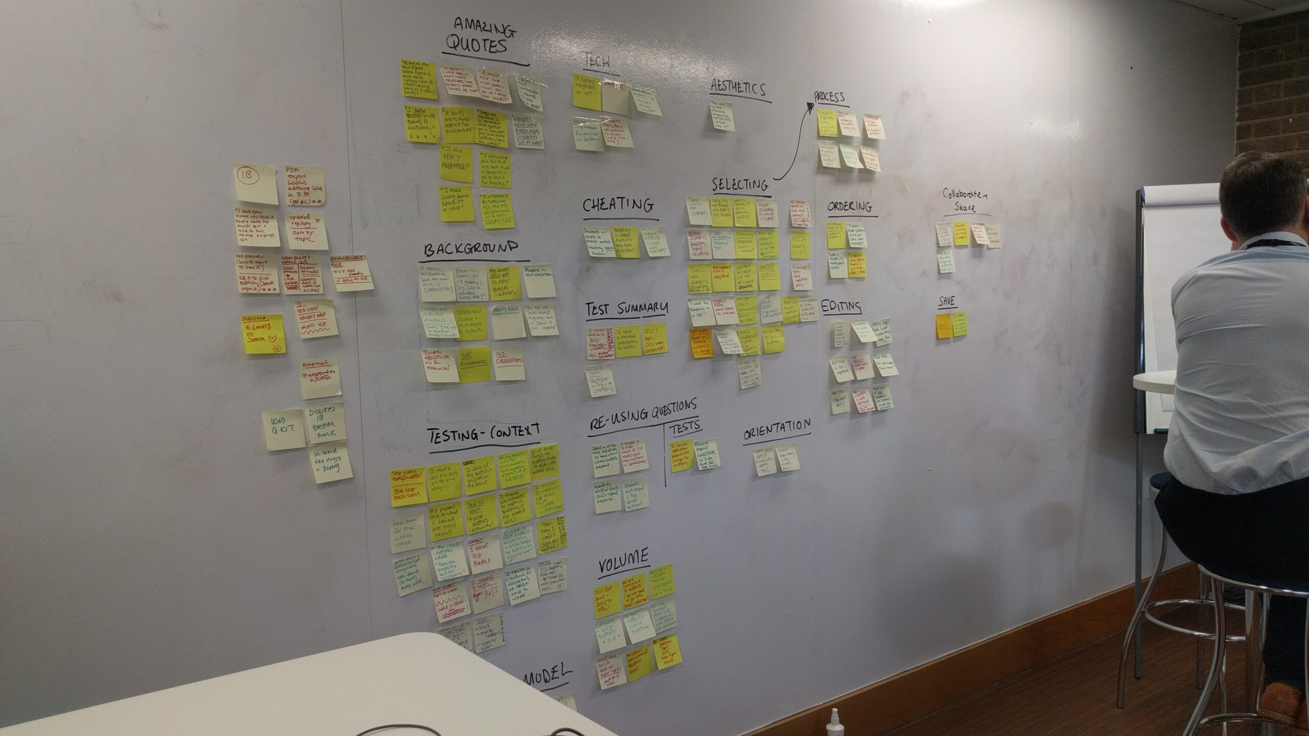
With the building-blocks newly in place, the first thing we produced was a new set of proto-personas. As the journey they were designing was for Certificate of Proficiency in English (CPE) customers, it was important that the journey be optimized for users for whom English was not their native language.
In addition to clear copy and guidance and intuitive navigation, the experience needed to demonstrate a clear improvement over the more traditional paper-based testing methods. With personas in place, and the entirely native-English-speaking product team thinking from their user’s perspective, we were ready to present solutions.
Implementation
I first presented quick wins and improvements that could be made immediately and with as little disruption to their intended roadmap. I wanted to present simple changes with big impact, in order to build up the team and set the tone for what I knew was going to be a very big overhaul on their original design. I then gave them a hand-off report with all of my findings, suggestions, process improvements, and next steps - including a recommendation that they delay the release of their MVP.
Tokens
Research revealed that users have no introduction or understanding of tokens or how to use them. After explaining the concept to them they failed to do any of the tasks asked such as request tokens, approve a token request, tell me how many tokens you currently have.
They raised valid questions such as ‘What is the value of a token, how much it is and how many tests can I set?’, ‘I don’t know how to do this, I’m sorry - can you explain how I do this?’.
Interestingly, all testers left to go to meetings or back to work at this point and gave up, this could translate to a teacher leaving the website and setting a test on paper instead, for free. I suggest we show them the value of sticking it out - analytics and results, this isn’t showcased anywhere.
Conclusion
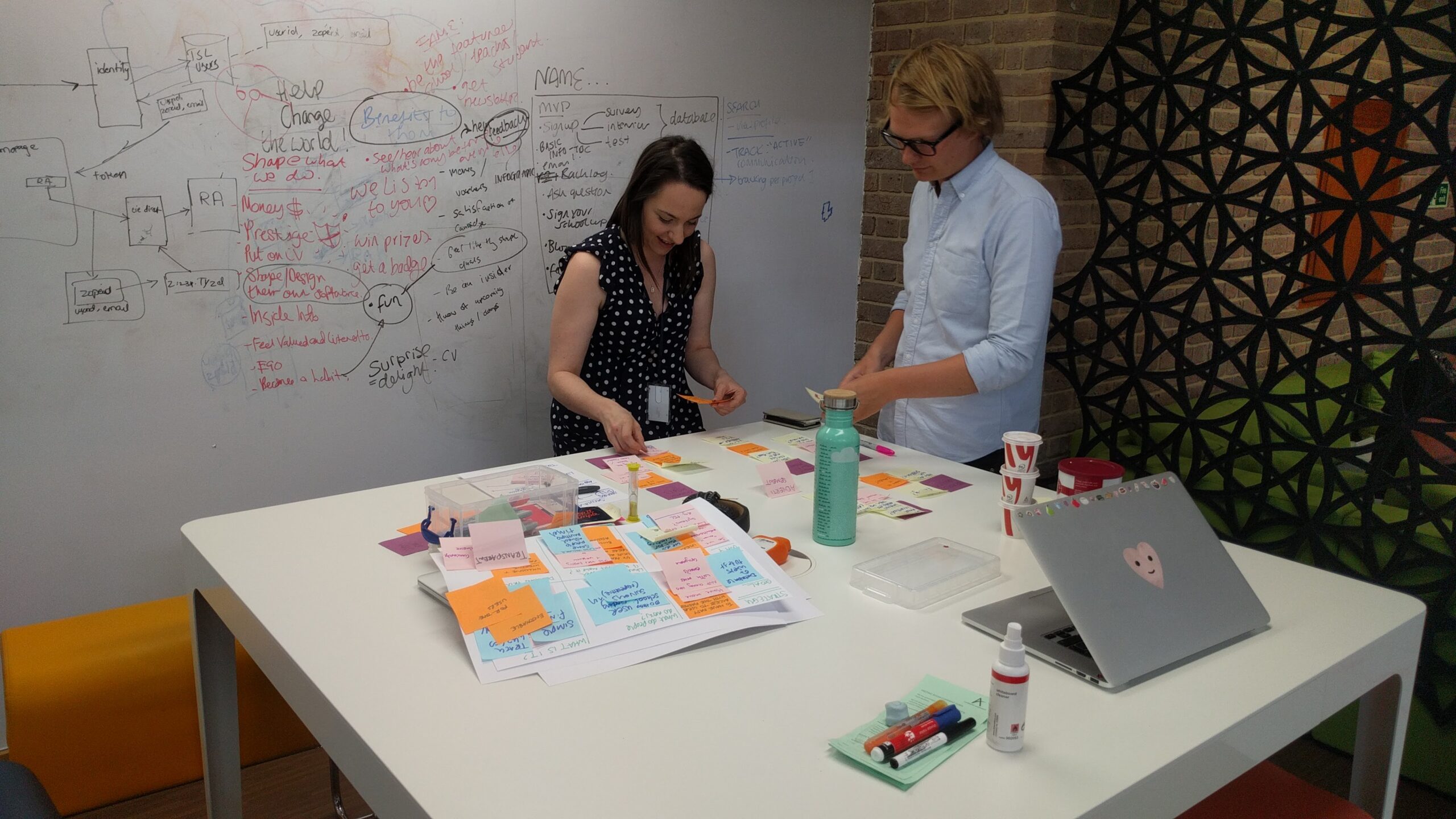
What I expected to be a short audit of a new product turned into a three-month workshop with an amazing team, excited to learn how to champion empathy and giving voice to their users. I created channels to set them up for continued success, including establishing user groups all over the world.
