CLIENT
talkSPORT
MY ROLE
UX Designer
SUMMARY
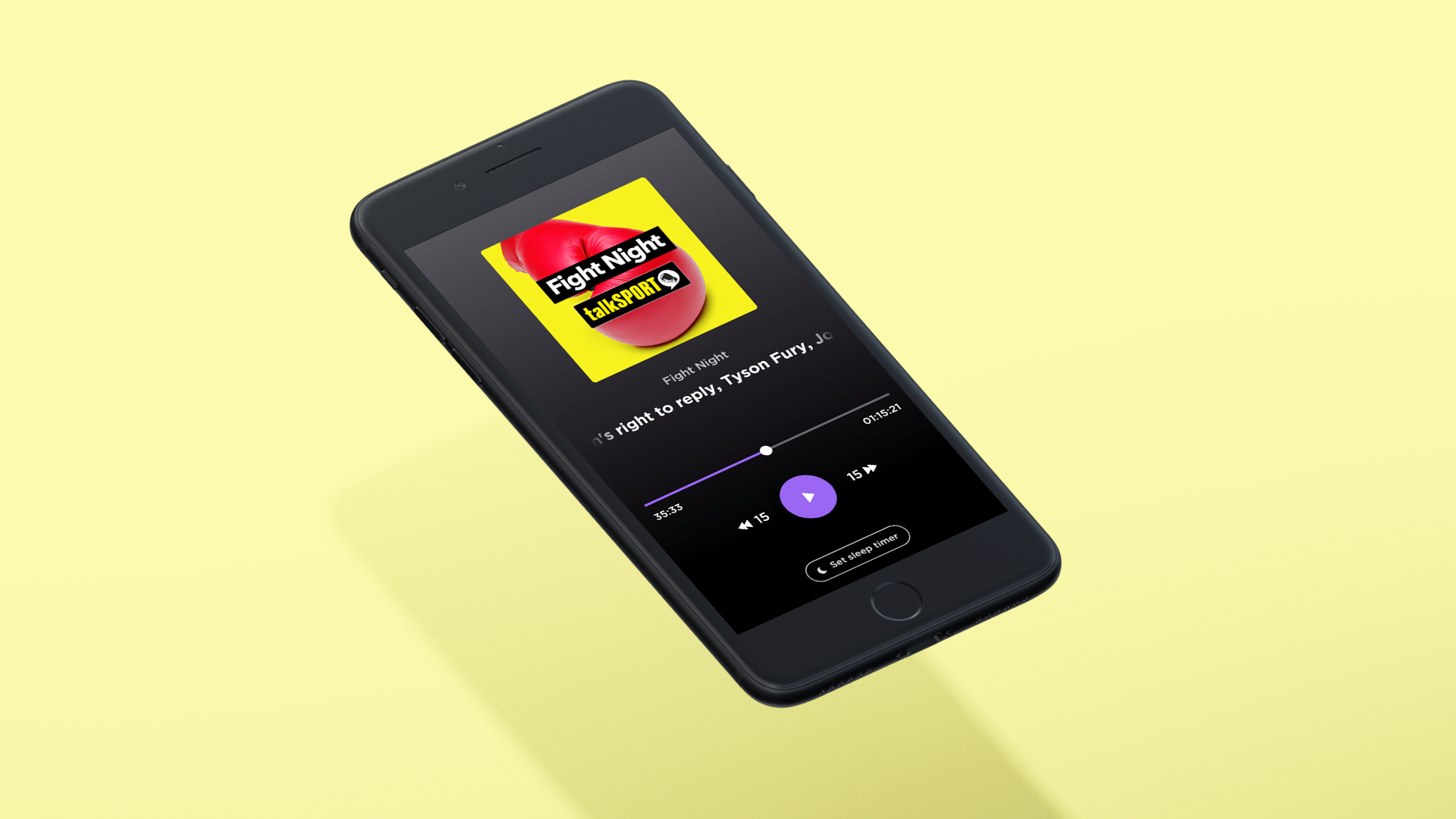
I researched and re-designed talkSPORT's app and created a re-brandable audio player.
PROBLEM STATEMENT
The existing talkSPORT [TS] app had a decent user base, and performed well at directing users to news articles and fantasy football - but did not lead to increased listening hours, which was a primary KPI.
Users were going straight to the web or 3rd party apps to listen, rather than using our app, meaning TS was not able to monitise these listening hours via advertisers, or engage listeners with addition content.
I was tasked with creating a talkSPORT and talkSPORT2 MVP design and roadmap that would turn the existing app into a proper audio content service generating real revenue.
talkSPORT is the world’s biggest sports radio station, with over 3 Million loyal listeners - and when I joined their team in 2019, was only accessible through DAB radio and a pop-out web player. I was brought in as Lead UX designer to bring those 3 Million users to a native talkSPORT app, from scratch.
Project Goals
Create a best in class audio player
Capture user data
Increase listening hours
White-label UX for future products
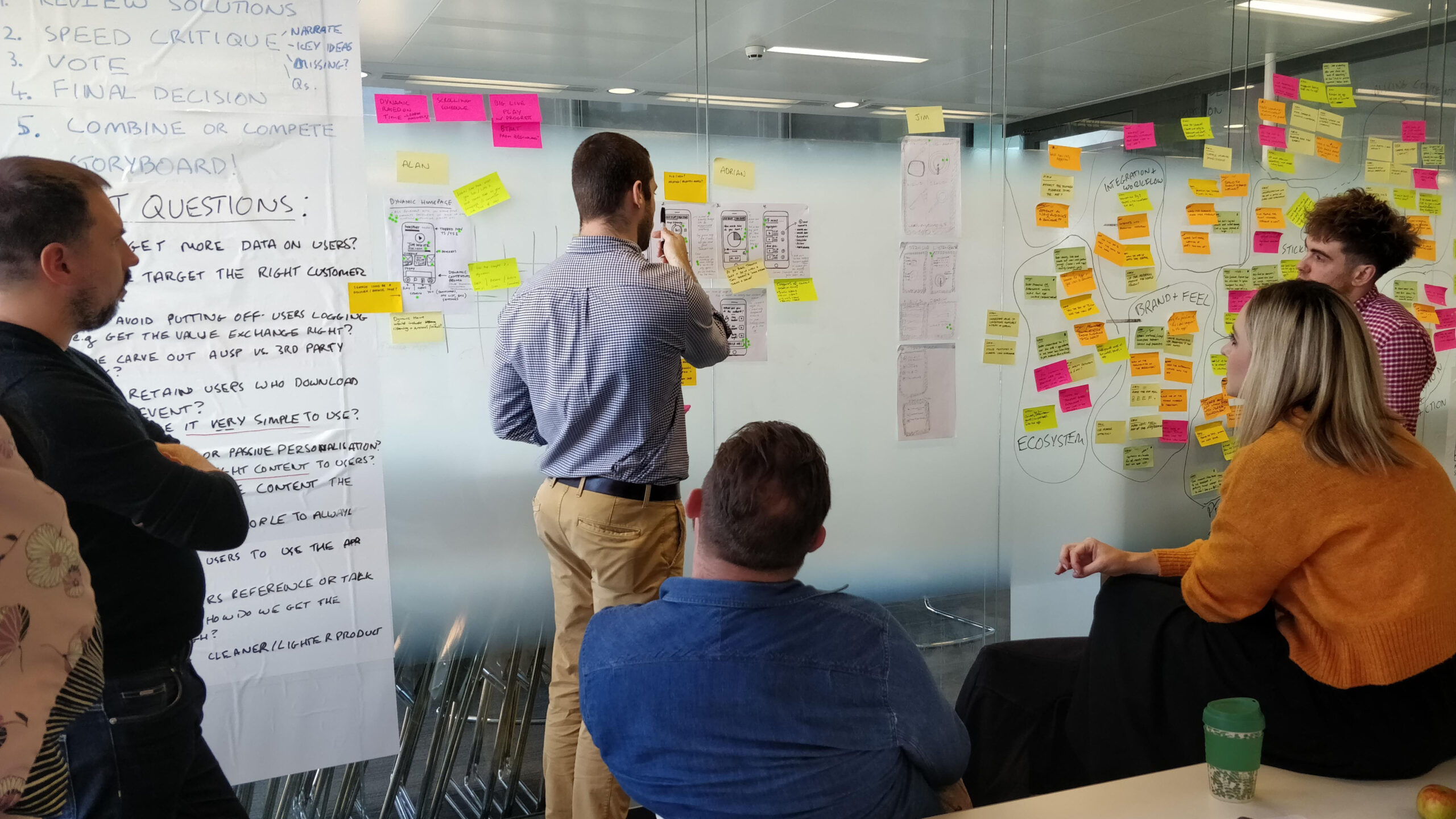
DESIGN STUDIO
APPROACH
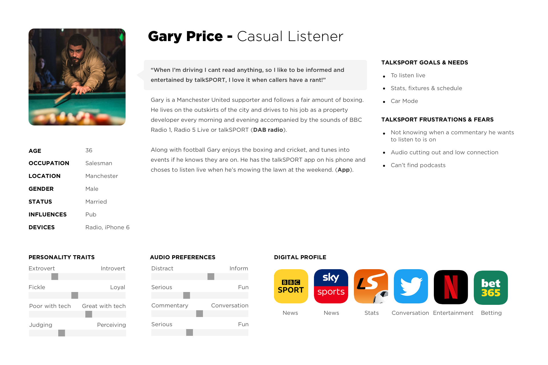
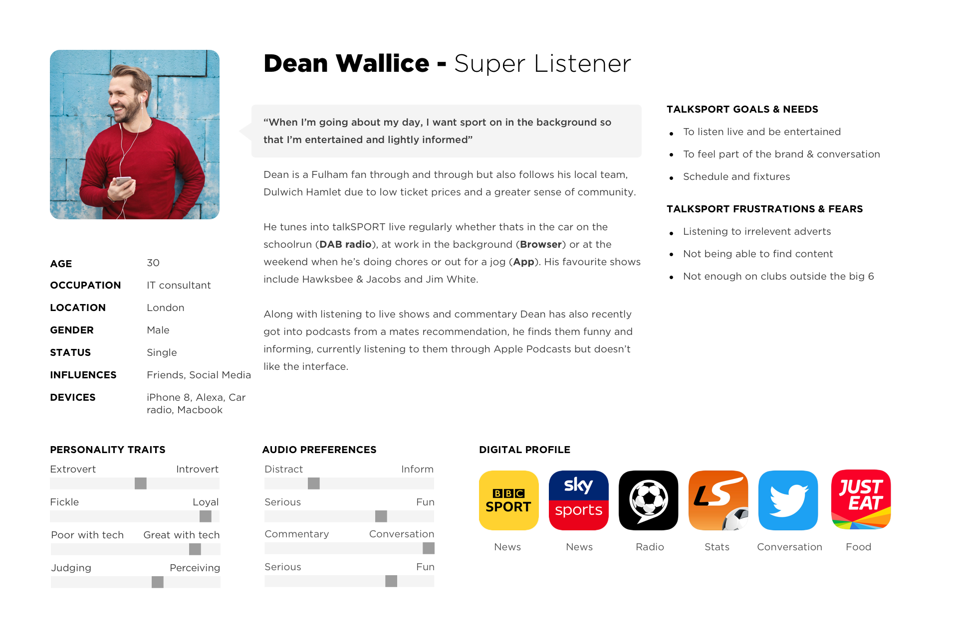
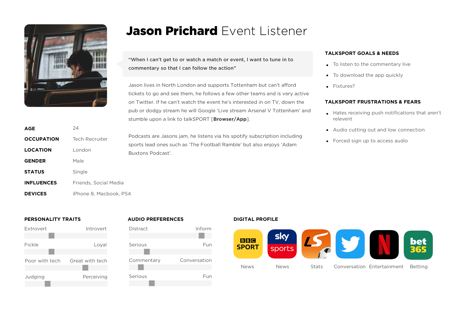
I began discovery by researching the current users’ journeys and behaviors, alongside a competitor analysis of features and product positioning.
Followed by three weeks of design sprints - which each included a full day of user interviews and prototype testing - to refine our MVP around user feedback to deliver the highest-impact features in the shortest time.
RESEARCH METHODS
Customer Interviews
Information Architecture
User Journeys
Market Research Analysis
Design Studio
Confident in our research, we created initial MVP prototypes in Principle, as it was the only software at the time that allowed us to include real audio clippings for the most realistic app appearance.
PROBLEM STATEMENT
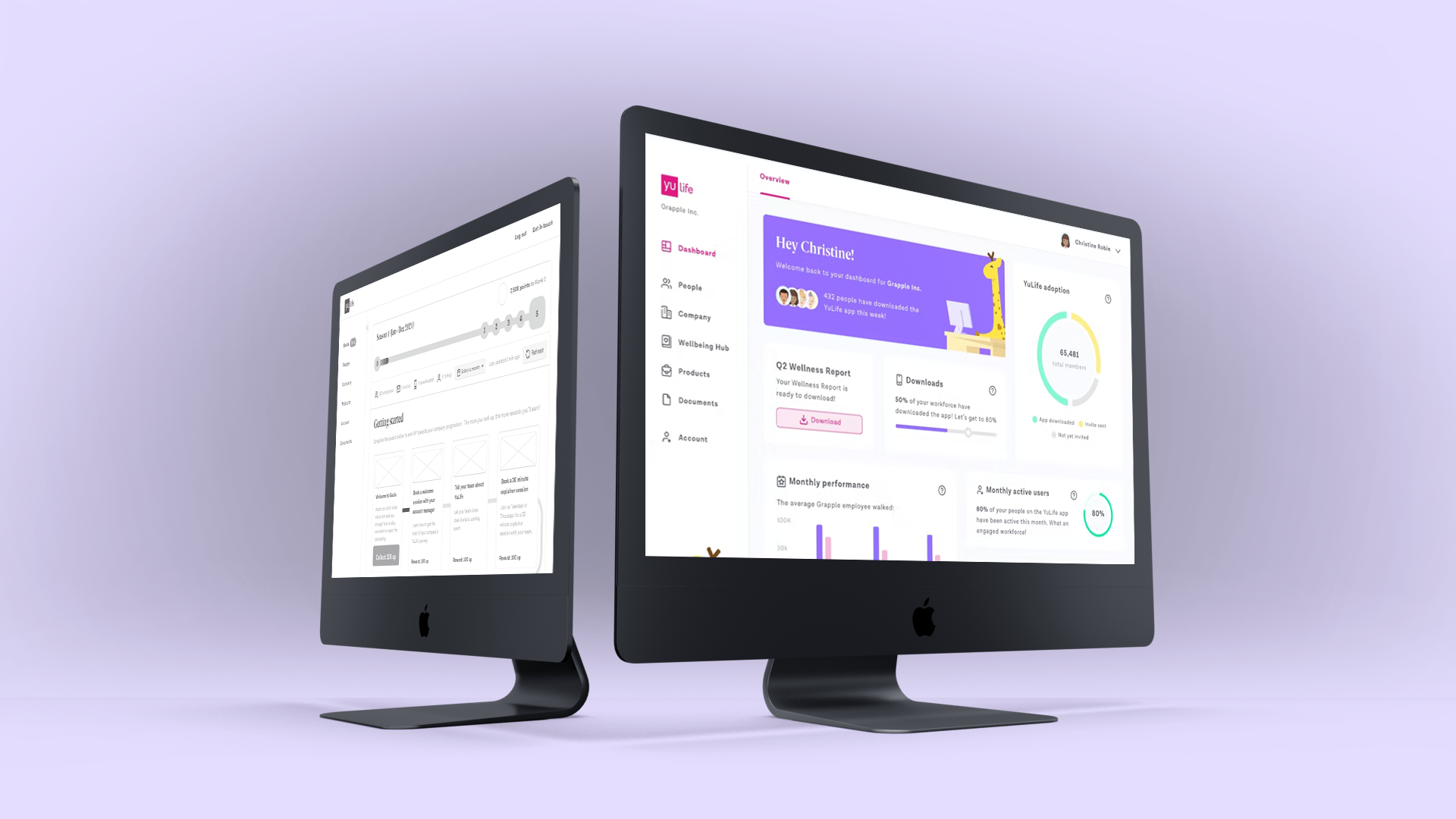
Employers need an admin dashboard to track and encourage employee app usage so that they can improve their physical and mental well-being.
PODCASTS
I began discovery by researching the current users’ journeys and behaviors, alongside a competitor analysis of features and product positioning.
Followed by three weeks of design sprints - which each included a full day of user interviews and prototype testing - to refine our MVP around user feedback to deliver the highest-impact features in the shortest time.
Selected Works
